“Mark Rothko,” a retrospective of the Abstract Expressionist’s career at the Fondation Louis Vuitton, Paris, is a remarkable show. Rothko, born Markus Rothkowitz to a Jewish family in Daugavpils in 1903 in what was then the Russian Empire, denied his painting was abstract. “My art is not abstract; it lives and breathes,” he once said. Artists tend to reject labels attached to them, but it is nevertheless difficult to avoid pinning the “abstract” button on Rothko, if only for the sake of convenience. Rothko also couldn’t understand how some viewers found his pictures serene, given that, in his words, he “imprisoned the most utter violence in every inch of their surface.” Christopher Rothko, the painter’s son and the exhibition’s co-curator, tells us in the catalogue that Rothko expected viewers to “participate” in his paintings; if, in doing so, some of these viewers felt serenity when the painter intended for them to feel dread, then perhaps that is just the way art goes.
The exhibition provides a complete tour through Rothko’s career, even covering his often-overlooked figurative work. In 1913, at age ten, he left Russia with his family for Portland, Oregon. He was later granted a scholarship to Yale, but he studied there for just over and year, and this scholarship was not renewed. After Yale he moved to New York in 1925 and joined the Art Students League. (Somewhere in the interim, he returned to Oregon for a time; there, he joined an acting troupe led by Josephine Dillon, Clark Gable’s first wife. In one play, Gable himself was Rothko’s understudy.)
The exhibition’s first room displays Rothko’s early work, which is chiefly figurative. Heretical as it may be, I enjoyed these early pictures and their depictions of 1930s New York. That same decade, he became a student of Milton Avery, who became his close friend and mentor. Inspired by Rembrandt’s self-portraits, Rothko limned his own in 1936: disguised behind dark spectacles, he stands, unsmiling, with a distinct intensity. The shades add to his remoteness—he looks like he knows something we don’t and never will. Other pictures from the period capture the loneliness of New York during the Great Depression. The Subway (1937) shows a procession of isolated, frighteningly thin figures cut off from one another. Rothko painted a number of similar scenes in subway stations; they are always uncrowded, indicating that he worked during the city’s lonely, off-peak hours. The emphasis on architectural framework as flattened fields of color seems to foreshadow his turn to abstraction.
Indeed, the break between Rothko’s figurative and abstract painting is less complete than one may imagine—an insistent passion runs throughout all his work. Underground Fantasy (ca. 1940), a gem of the exhibition, is a figurative work that displays the same fervor of feeling present in his best abstract work; the many layers of oil here accumulate into a surface of pale color emanating a poignant melancholy. He distorts his subjects—four women and two men—into elongated forms against the beige background, almost to the point where they are no longer recognizably human. At one point, Rothko abandoned painting altogether because he considered it impossible to portray human figures without “mutilating” them. Perhaps this explains, in part, his shift toward painting devoid of all figures.
By 1939, Rothko had become involved in leftist politics in New York. Despite this, he resisted efforts by communist hardliners intent on enforcing artistic standards according to party line. Pushing back against calls for more realist art, he maintained the vitality of art’s independence and the need to explore new forms. Above all, he was seeking new directions for his own art. Inspired by MOMA’s 1936 exhibition “Fantastic Art, Dada, and Surrealism” and his reading of Aeschylus and Nietzsche, he moved into the second stage of his artistic career.
This stage saw another step toward abstraction. Moving out of the subway station, his themes become more mythic and oblique. The Omen of the Eagle (1942), a chaotic, almost surreal oil on canvas, borrows images from Aeschylus’s Oresteia; the eagle depicted is heavily abstracted and monstrous looking. For Rothko, haunted by the pogroms of his childhood in Russia and by the news coming from Nazi Germany, ancient Greek myths provided ways of grappling with and explaining the century’s horrors. Omen’s eagle is grotesque, and there is something abominable about the scene, but the colors chosen still seem bathed in a sort of Greek light; for this reason, the piece evokes the work of John Craxton.
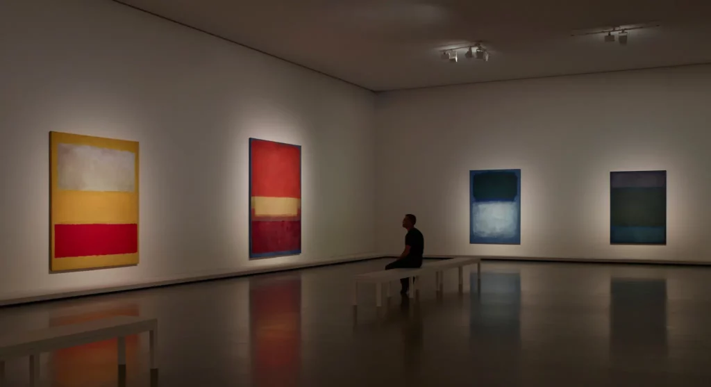
In 1946, Rothko completed his journey toward the totally abstract. His canvases began to be filled with his famous “multiforms,” rectangles of various sizes, shapes, and colors distributed across a field of juxtaposing color. For the first decade of this stage of his career, he used a wide range of colors, both bright and dark. No. 7 (1951) holds a bright pink multiform above a much larger yellow one underneath, and beneath the yellow sits a blazing orange. No. 21 (1951) shows a darker orange surrounded by a deep black that seems to be consuming the smaller multiform. Subtle shifts in color at the soft edges of each rectangle in Ochre, Red on Red (1954) make for a mysterious canvas. The complexity of his color is elsewhere on display in Green on Blue (Earth-Green and White) (1956); here, the numerous layers of paint under the top surface glow outward like an amethyst stone, though initially the canvas looks like a simple application of black and white on a blue background. The year 1956 saw a shift toward darker shades and moods in general. Bright colors still appear, but their presence seems chiefly to elevate the darks. In general, these paintings demand dedicated contemplation from the viewer, even meditation. Their nature only reveals itself after many hours of study.
The exhibition has pulled off an impressive coup in their presentation of the pictures from the Tate’s Rothko Room. The twelve murals from the Tate were originally commissioned by the Four Seasons restaurant in the Seagram Building in New York; Rothko was initially thrilled by the challenge of blending his painting with the restaurant’s architecture, which consists itself of strong verticals in its frames and ornamentation. He believed his multiforms would have the effect of windows or portals in this environment. But shortly after accepting the commission, he became disillusioned: he dined at the restaurant himself and realized he couldn’t imagine the venue’s clients understanding his art. He canceled his contract and paid his advance back, but did not abandon his concept; instead, he donated the pieces to the Tate—he was pleased they’d be placed near the museum’s Turners—with very specific instructions on how they are to be displayed. He desired their arrangement to be compact, almost relentless, in a room only subtly lit. The FLV has replicated these conditions wonderfully.
Black on Maroon (1958) and Red on Maroon (1959) are indicative of Rothko’s turn toward more somber hues. This turn became sharper with the transition of his multiforms into “blackforms” during the Sixties. These blackforms see his palette reduced primarily to browns, reds, purples, and blacks. But the pieces maintain their complexity. In No. 8 (1964), for example, a casual look seems to reveal nothing more than a black canvas. But a longer study uncovers a vast array of shades and unexpected hues, and soon one begins to feel like there’s no limit to the colors contained.
Surprises like this populate FLV’s “Mark Rothko.” It is a fascinating and rewarding show that only becomes the more so the longer one spends with it.