Robert Motherwell, born in 1915, was the youngest of the hard core of the Abstract Expressionists, ten or more years junior to such colleagues as Willem de Kooning, Barnett Newman, Adolph Gottlieb, Clyfford Still, Mark Rothko, Arshile Gorky, and his good friend David Smith. Only Jackson Pollock, born in 1912, was close in age (though Motherwell, who died in 1991, outlived him by nearly half a decade). There may be other Ab Ex candidates of a similar chronological distinction, especially given the present appetite for inclusivity and expanding the canon. But there is no doubt that Motherwell was the best-educated, and quite probably the best-read, of the group, having studied philosophy and nineteenth-century French art at Stanford and Harvard, and having begun yet another degree at Columbia with Meyer Schapiro. Schapiro convinced the young man to concentrate on painting instead of scholarship, but Motherwell remained a voracious reader, with especially deep knowledge of French poetry and James Joyce’s writing. A lifelong Francophone who traveled frequently to France, and commanding several other languages, Motherwell was, it can be argued, the most sophisticated and the most intellectual of his artist colleagues. Beginning in his twenties, he lectured at prestigious institutions, oversaw a Surrealist magazine, founded another vanguard publication, and edited the Museum of Modern Art’s series of publications of artists’ writings, among other ambitious enterprises.
Like Édouard Manet and Paul Cézanne, and unlike the great majority of his colleagues, Motherwell came from an affluent family. But it was his worldliness and wide-ranging knowledge that really set him apart. When the so-called artists in exile—Europeans including Fernand Léger, Yves Tanguy, André Breton, and Max Ernst—arrived in New York, fleeing the Nazi onslaught, Motherwell was one of very few Americans admitted to their (mainly Surrealist) circle. In 1943, along with Jackson Pollock and William Baziotes, he was invited by Peggy Guggenheim to make collages for exhibition at her Art of this Century Gallery, which emphasized Surrealism and abstraction. “I had culture with a capital K,” Motherwell once explained to me, with characteristic wry wit. So it is not surprising that his work, throughout the five decades of his life as a painter, draftsman, and printmaker, should seem different from that of most of his peers. It was often constructed with more refined gestures, more subtly varied surfaces, and a more restrained palette. While Motherwell’s colleagues usually committed to a signature image, he remained restlessly experimental. He revisited motifs, configurations, and palettes that resonated with him, but he varied them (sometimes reworking earlier versions) and also explored completely new ones. Over the years, there often seemed to be a struggle for dominance between sensuous gesture and austere geometry in his strongest paintings—the overscaled sweeps of the Elegies to the Spanish Republic versus the minimal rectangles and delicate drawing of the Opens, for example—extremes that only rarely coexist in a single work.
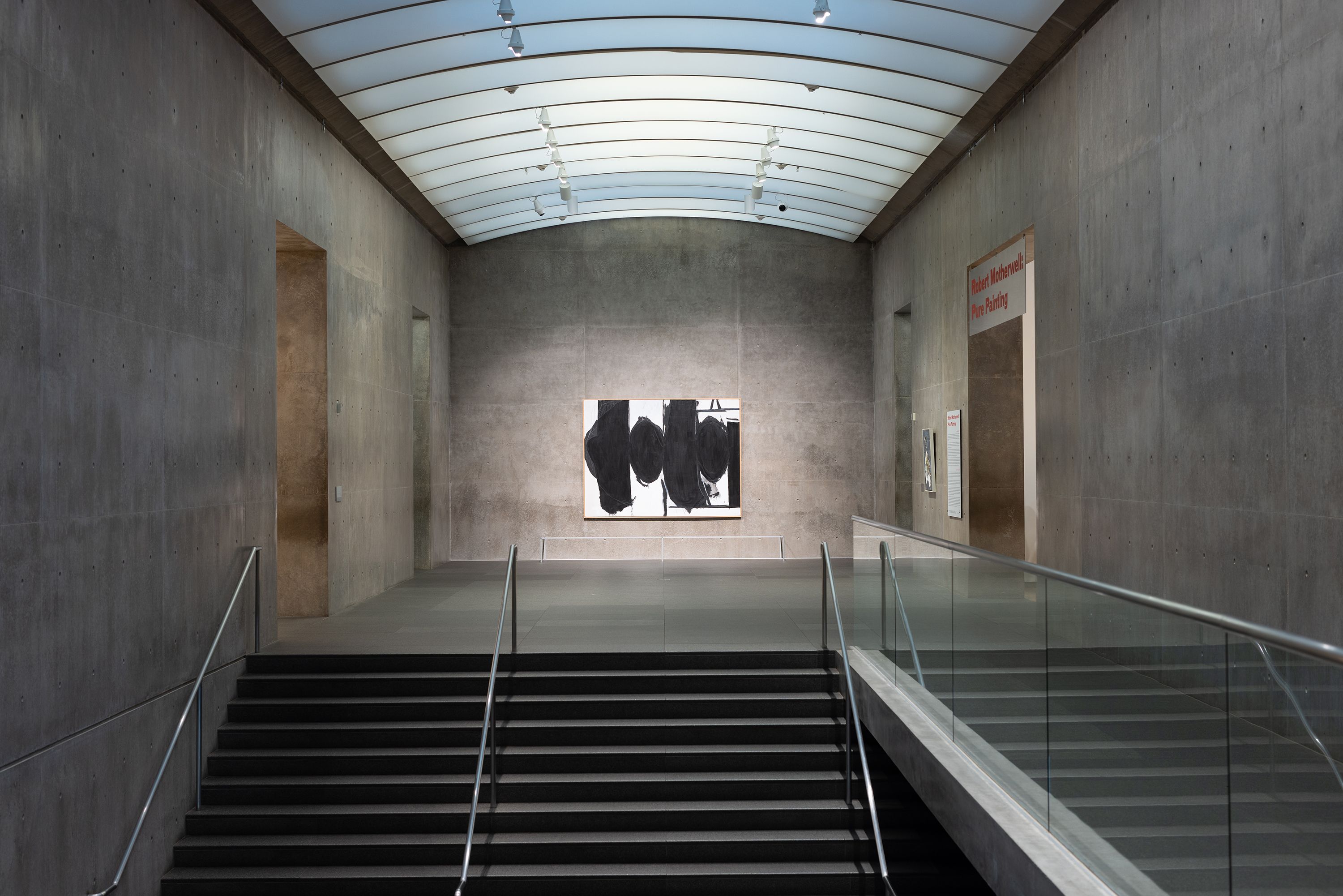
Last winter and spring, the Menil Drawing Institute in Houston celebrated Motherwell’s works on paper with a superb survey (reviewed by Leann Davis Alspaugh in The New Criterion of February 2023). This summer, “Robert Motherwell: Pure Painting,” a comprehensive exhibition at the Modern Art Museum of Fort Worth, expanded our knowledge of the artist’s achievement with a well-selected retrospective of more than fifty canvases, spanning 1941 to 1991.1 (A somewhat smaller version will soon travel to the Bank Austria Kunstforum, Vienna.) Now what’s needed is another show of his amazing collages; it has been almost ten years since the last major overview of these remarkable works—organized by Susan Davidson, the curator of “Robert Motherwell: Pure Painting”—was seen at the Guggenheim, New York.
In a statement about “what abstract art means to me” for the Museum of Modern Art Bulletin, Spring 1951, Motherwell wrote:
Nothing as drastic an innovation as abstract art could have come into existence, save as the consequence of a most profound, relentless, unquenchable need. The need is for felt experience—intense, immediate, direct, subtle, unified, warm, vivid, rhythmic.
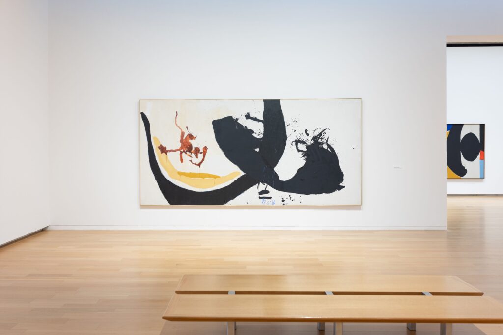
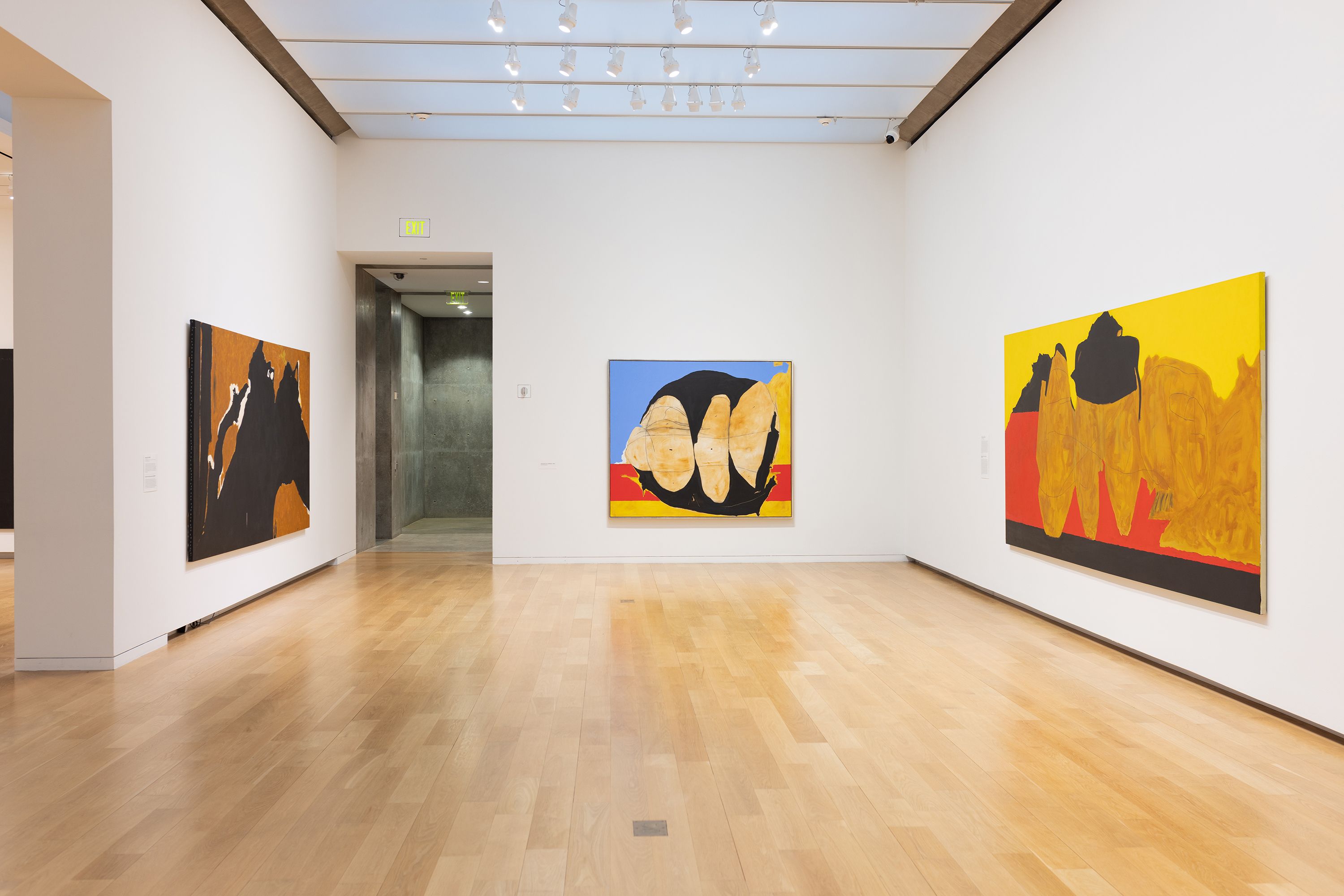
That declaration could have served as the introduction to the Fort Worth exhibition, since it describes most of the included works. The first thing we encountered was the museum’s own Elegy to the Spanish Republic (1962/1982), a stunning example of Motherwell’s best-known image, with its looming, confrontational ovals trapped between broad, descending vertical and near-vertical bands. (Many of the most potent paintings in the exhibition come from the Modern Art Museum’s collection, which boasts more than seventy works in various media by the artist, acquired by the museum’s director in the 1980s, the art historian E. A. Carmean Jr., in close consultation with his friend Motherwell.) The bold black-and-white Elegy, with its patch of brushy, transparent gray, reminds us of the artist we know, and, if we look hard, alerts us to variations of the motif to come. But we then meet the youthful Motherwell through La Belle Mexicaine (Maria) (1941), painted during his early sojourn in Mexico with his friend the Chilean Surrealist painter Roberto Matta Echaurren. The sitter, Maria Ferriera y Moyers, a Mexican actress and writer, later became Motherwell’s first wife; Matta introduced him to automatic writing. The modest-sized canvas, mostly grays and whites with centralized flashes of yellow, ochre, and a dash of red, presents us with a loosely suggested figure with even more loosely suggested voluminous clothing—perhaps puffy sleeves above a vertically striped skirt—carved out with a sinuous black line. The upright poise, spreading garments, and square face with a hint of eye and swipe of mouth, framed by more emphatic black lines, are vaguely Picassoid, but also they recall Diego Velázquez’s rigid infantas.
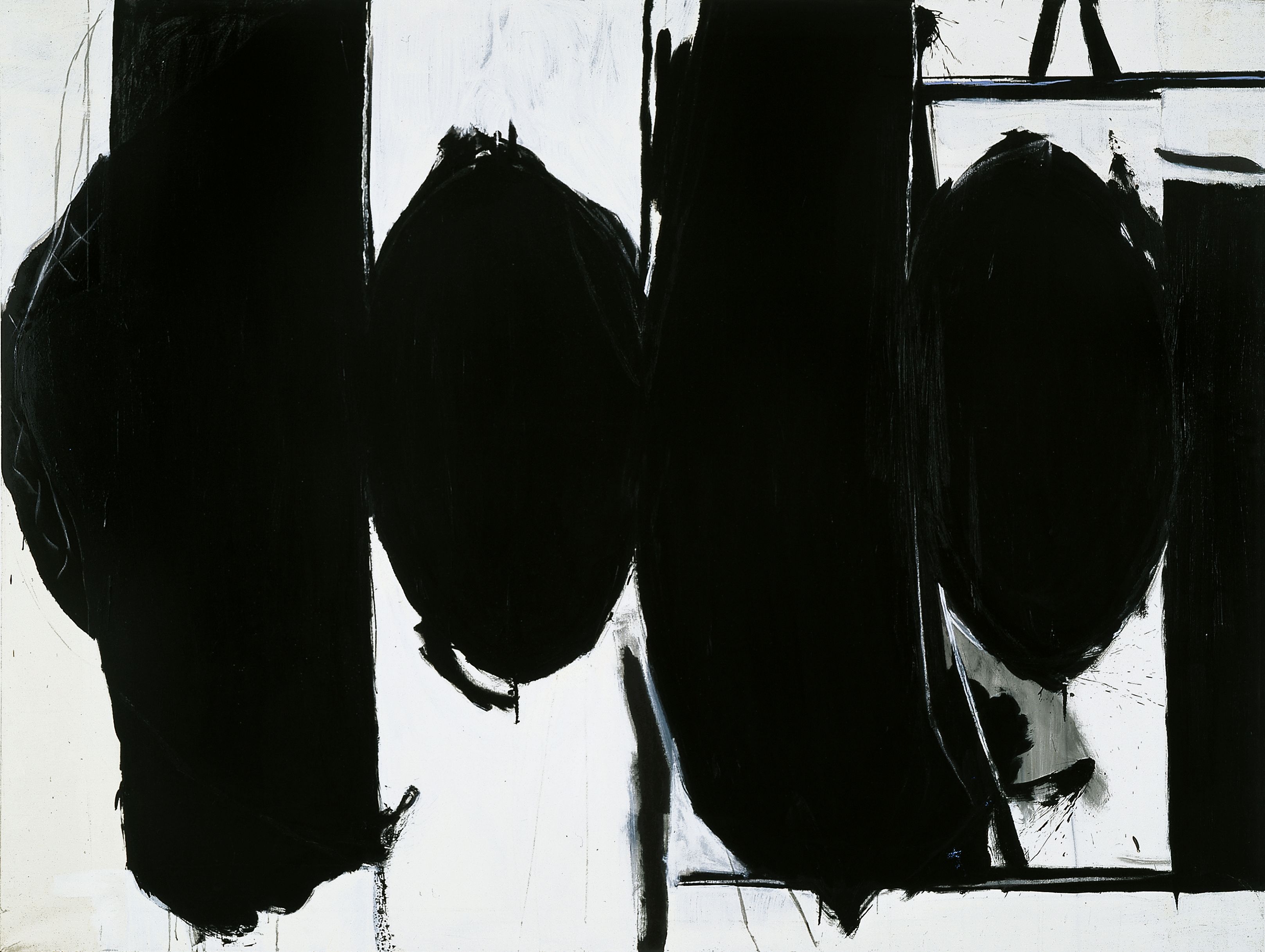
Together, the two paintings announce some of Motherwell’s main preoccupations: an innate sense of geometry that disciplines and harmonizes even the most explosive images; expansive calligraphic gestures, sometimes at monumental scale; restrained color; overtones of art history; Spanish references; elegance; and intensity. The selection and the installation nicely underscore these recurring characteristics at the same time that they emphasize Motherwell’s inventiveness. The result lets us, for example, see the continuity even between such apparently disparate works as those with controlled drawing and paintings with muscular, overscaled, spreading pools of black that seem about to engulf the entire canvas. The labels remind us of the artist’s well-furnished mind, expanding on his titles’ frequent references to poetry, literature, and politics, quoting from his beloved James Joyce, Paul Éluard, and Paul Valéry, among others. The dates reveal his willingness to revisit, alter, and reinvent.
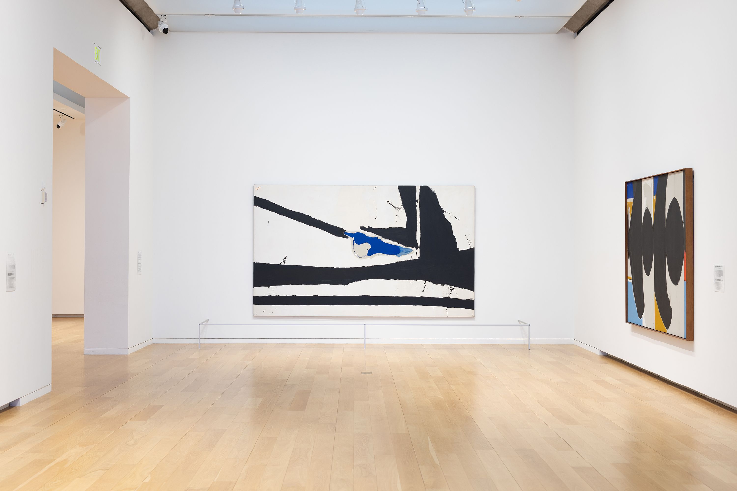
We can follow the reprises of the severe vertical stripes of The Little Spanish Prison (1941–44/ca. 1959/1969)—“automatism for me, at the time,” Motherwell told me—as their suggestion of prison bars is transformed, in Wall Painting with Stripes (1944/45), into a crisp row of broad, wholly abstract white and ochre verticals, overlaid with a swelling crescent of gray; a black oval floating between two white bands points ahead to the Elegies, as does the well-known The Voyage (1948–49) in the Museum of Modern Art’s collection, with its progression of black, white, and ochre verticals challenged by an emphatic bar of green in the lower left, a centralized white disc, and an aggressive black starfish shape. The Elegies themselves recur throughout the installation, sometimes with ochre penetrating the verticals of the image, rarely with notes of red or blue, becoming increasingly rough-edged and gestural. They span Motherwell’s mature career, from an example painted in 1953–54 to one completed not long before his death: the eloquent, urgently stroked Elegy to the Spanish Republic No. 172 (With Blood) (1989–90), with flickers of red caught in a triangle of off-white and escaping from the intersection of two black zones. Fragile black lines restate the verticals of the Spanish prison paintings, while a rapid swipe of pink at the bottom challenges the somber mood.
The Elegies caused Motherwell considerable trouble. When he and Helen Frankenthaler married in 1958, they planned an extended European honeymoon. First stop, Spain, despite their misgivings about the political climate of the Franco era. They were to attend the opening of “New American Painting” at the Prado, an exhibition organized by the Museum of Modern Art with six paintings by Motherwell, including Elegy for the Spanish Republic XXXV (1954–58). Soon after arriving in Madrid, Motherwell received a cable from moma informing him that the Spanish government would not hang the Elegy unless the name were changed. He refused. Meanwhile, the U.S. embassy learned that the painter had been declared persona non grata in Spain and urged the couple to leave the country as soon as possible. Furious at the censorship, Motherwell instructed moma’s curator to remove all his works from the show. He and Frankenthaler settled for the rest of the summer in the French fishing village of Saint-Jean-de-Luz, renting a slightly decayed villa near the beach, with room for both of them to paint.
Motherwell came to New York to study at Columbia in 1940, when Henri Matisse’s masterly Bathers by a River (1909–10/1913/ 1916–17) was still on view in the lobby of the Valentine Gallery. Despite the painting’s obviously different mood and affect, the row of schematic figures in Matisse’s pastoral idyll, with oval heads and buttocks caught between vertical bands, seems to haunt the Elegies.
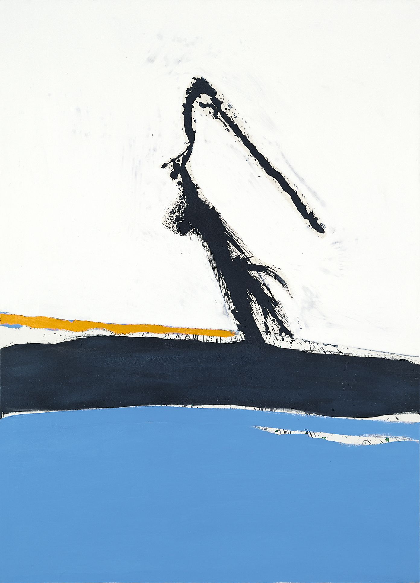
Motherwell’s lifelong admiration for Matisse, translated into something wholly personal—as in the Elegies—is visible in many of the exhibition’s other works, such as the exuberant Caprice No. 3 (1962), with its flung arc of black above radiant blue, inspired by Motherwell’s watching surf break against the seawall of the “Sea Barn,” the house and studio he and Frankenthaler occupied beside Provincetown Bay on Cape Cod in the 1960s. Even more Matissean are the joyous Summertime in Italy No. 28 (1962), with its delectable, almost Rococo palette of rose, ochre, white, and blue, and the nuanced, radiant August Sea No. 3 (1972), with its economical black vertical and horizontal lines against an expanse of the blue (almost) of the Gauloise cigarette packages that Motherwell recycled into his collages. August Sea No. 3, in fact, could be read as an homage to Matisse’s View of Notre-Dame (1914), first exhibited at moma in 1966—a brushy field of blue with the boxy shape of the cathedral minimally outlined.
The Open series, begun in the mid-1960s, is memorably represented by an entire gallery devoted to these pared-down, seductive paintings. Provoked, we learn, by Motherwell’s seeing a small canvas propped against a larger one, at a time when he was seeking to simplify and clarify his imagery, the Opens could be described as the most extreme response to implications of View of Notre-Dame. They share a radically minimal composition of an outlined rectangle, usually placed at the top of the canvas, but are otherwise astonishingly varied, as Motherwell explored differences in proportion, color, and even in ways of referring to the “window.” We are confronted by demanding works that range from a black outline against a ragged ochre rectangle filling half the canvas to a smooth gray field with a luminous green “window” that somehow encapsulates the experience of looking out at a landscape in bright sunshine, its luminosity enhanced by an abrupt black bar on the right and, if we look closely, faint escapes of ochre at the edges of both bar and window. The Opens are deceptively straightforward and declarative. They insist that we pay attention, and when we do, there’s always more to look at than seems first apparent, small details that contradict the seeming minimalism of the compositions. The moods of the Opens vary impressively. Witness, in contrast to that light-struck green window, the somber Open No. 150 in Black and Cream (Rothko Elegy) (1970), an implacable, solemn response to the suicide of Motherwell’s close friend, or the eye-testing Plato’s Cave (1973), with its barely hinted-at geometric drawing against a dramatically inflected black/gray expanse. Motherwell returned to more gestural, explosive compositions in his last decade, but the clarity of the Opens, already present in the underlying geometry of his earlier work, continued to inform even his most seemingly spontaneous compositions. The same is true of his drawings, collages, and prints. It’s as if he couldn’t help putting pictorial incidents in exactly the right place, no matter what medium he was working in.
There are consistent high points as we move through the exhibition: deservedly familiar and celebrated works, surprises, and occasionally puzzling canvases, installed more or less chronologically. It’s exhilarating to be faced with the vast (eleven and a half feet wide) New England Elegy No. 2 (1965–66), with its speedy, oversized nested black angles and floating patch of bright blue, and almost startling to encounter the even larger (twenty feet wide) crisp, graphic Elegy to the Spanish Republic No. 100 (1962–1975). It’s fascinating to come across The Voyage: Ten Years After (1960–61/1962), much larger than the 1948–49 painting it recalls (yes, it’s more than ten years later) and apparently only tenuously related to that first iteration, with wide panels of yellow ochre and a vertical black band. The generous spatter of blue and the squiggly amoeba-like patch of transparent, modulated ochre/brown in the center have no cognates in the earlier painting. Since the title The Voyage refers to Charles Baudelaire’s poem in Les Fleurs du mal, it’s possible that Motherwell felt that the first version was too cool and disciplined to evoke fully the flavor of the verse, provoking the unfettered, uninhibited second canvas.
Some examples on view were slightly out of context because of the layout of the museum’s Tadao Ando building, with its generous main galleries flanked by narrower circulating spaces. Yet by the time we reached those peripheral galleries, we were so attuned to Motherwell’s language that we understood the relationship of whatever we encountered to the works we have just seen. Some remind us of how adventurous Motherwell could be, as in the delicious A Rose for James Joyce (1988), a wonky green oval against a vertical black ground, held by slightly tremulous white lines, or the pale, fierce Je t’aime No. III with Loaf of Bread (1955), an irresistible field of insistently brushed off-white that both supports and drowns elements ranging from casually indicated geometric shapes to the titular loaf, and to rather brutal script. The name comes from a Paul Éluard poem. There are several versions of the theme, some intensely colored, all fairly rough-hewn; this one was given to Clement Greenberg and Janice van Horne as a wedding present, a connection that underscores Motherwell’s close ties with the central art-world figures of his day. Not only was he married to Frankenthaler (his third wife), but his friends included David Smith, William Baziotes, Mark Rothko, Piet Mondrian, Adolph Gottlieb, and many more. Time for an exhibition about aesthetic exchange and cross-fertilization?
In the meantime, “Robert Motherwell: Pure Painting” provides illuminating insight into the evolution and achievement of one of Modernism’s most compelling artists. If you couldn’t get to Fort Worth before the middle of September, there will still be the version opening this month in Vienna. If Vienna is not possible, the exhibition is accompanied by an elegant catalogue with contributions by the curator and other scholars, a small selection of Motherwell’s writings, and a comprehensive chronology. The abundant images and the checklist don’t entirely correspond to the exhibition, but you can’t have everything.