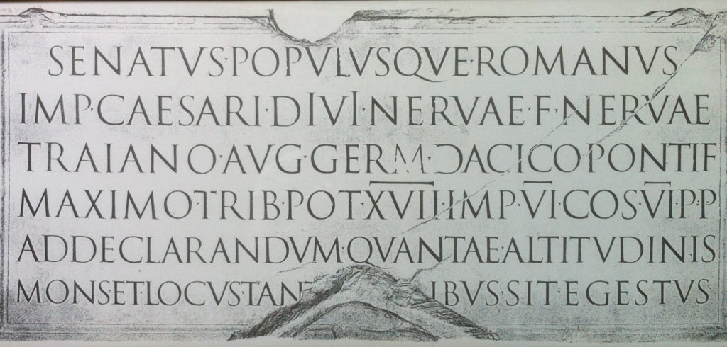
Among the first fonts issued by Adobe Systems under its “Originals” program was an adaptation of the letters inscribed on the base of Trajan’s column in Rome. I had a copy of Adobe Trajan on my computer as long ago as 1996, and the fonts have since been bundled with so many software packages that most users—knowingly or not—own the fonts.
I’m not entirely certain what it says about me as a designer of books that I have—as best I can recall—never used Adobe Trajan in one of my projects. No doubt there have been at least a few opportunities to use the font, yet a quick scan of the books on my shelves offers not a single instance.
To my eye, it is comparatively difficult to use Trajan well and oddly easy to use it badly. The font harmonizes poorly with most text faces, and its refined scale and extreme formality rarely seem suitable for book work. Not that I haven’t experimented, but after a few frustrating test settings, I invariably swap out Trajan for something else, and the page quickly snaps into focus. I know that when I see the type in other designers’ books, I almost invariably find fault with the design—not solely for the choice of type, but for other decisions as well.
The problem with Trajan is one of context. My hesitation in using the type has something to do with my doubts about the suitability of using letterforms from