Was it only happenstance that made the special, long-term exhibition “Spilling Over: Painting in Color in the 1960s” at the Whitney Museum of American Art overlap with “Epic Abstraction: Pollock to Herrera,” the Metropolitan Museum of Art’s recent reinstallation of its twentieth-century galleries?1 Whether the concurrence was accidental or deliberate, it makes for interesting comparisons. While neither show is a complete account of the period it reviews, together they offer a fairly broad survey of painting from the late 1940s to the 1970s. Some artists are represented at both museums, but with different aspects of their work, while others, including some we might expect to see in both exhibitions, are in only one, so visits to both the uptown and downtown shows are advised for the most comprehensive overview and redress of omissions. The Whitney’s “Spilling Over” (the title comes from the painter Bob Thompson’s description of how his work responds to his inner imperatives) is the more coherent and tightly focused of the two exhibitions—not surprisingly, since, unlike “Epic Abstraction,” it deals (mainly) with a single decade and includes only eighteen works. Yet, like the Met’s show, “Spilling Over” aspires to celebrate the best-known artists of the period it surveys and, at the same time, remind us of the achievements of some of their less familiar but deserving colleagues. What distinguishes “Spilling Over” is its clearly articulated theme: an exultant examination of the varied role of color in the work of a remarkably wide-ranging selection of artists. For David Breslin, the Whitney’s DeMartini Family Curator and Director of the Collection, who organized the show with Margaret Kross, a curatorial assistant, “Color as a formal, social, and political matter feels particularly urgent today.” But, he notes, “the artists in ‘Spilling Over’ already saw it as a means to bridge the seen and the felt, the conscious and the unconscious, the political and the environmental.”
I’m not sure what “social,” “political,” or “environmental” means in relation to color. What about color as pure delight?
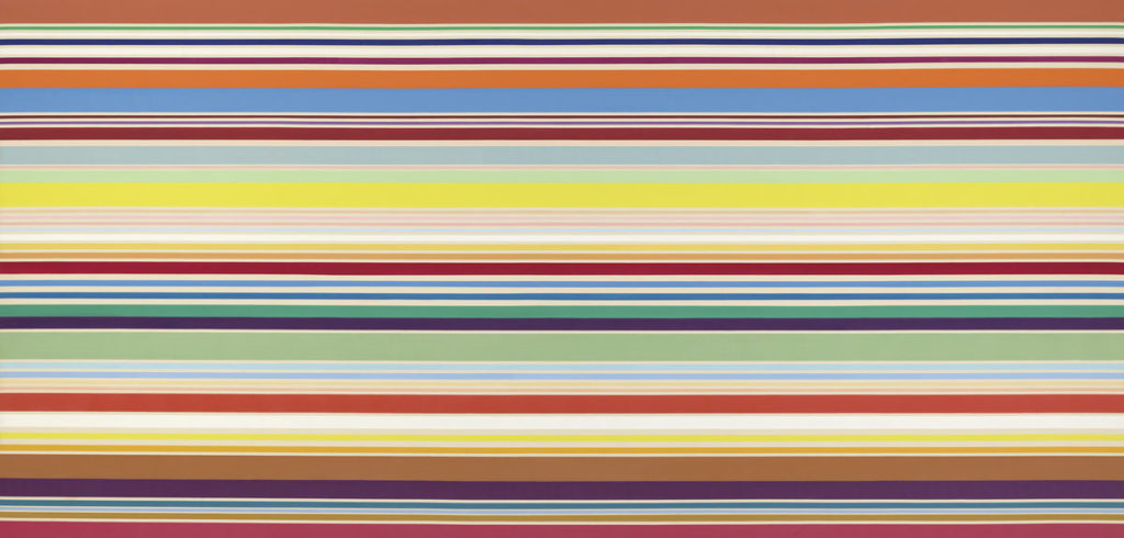
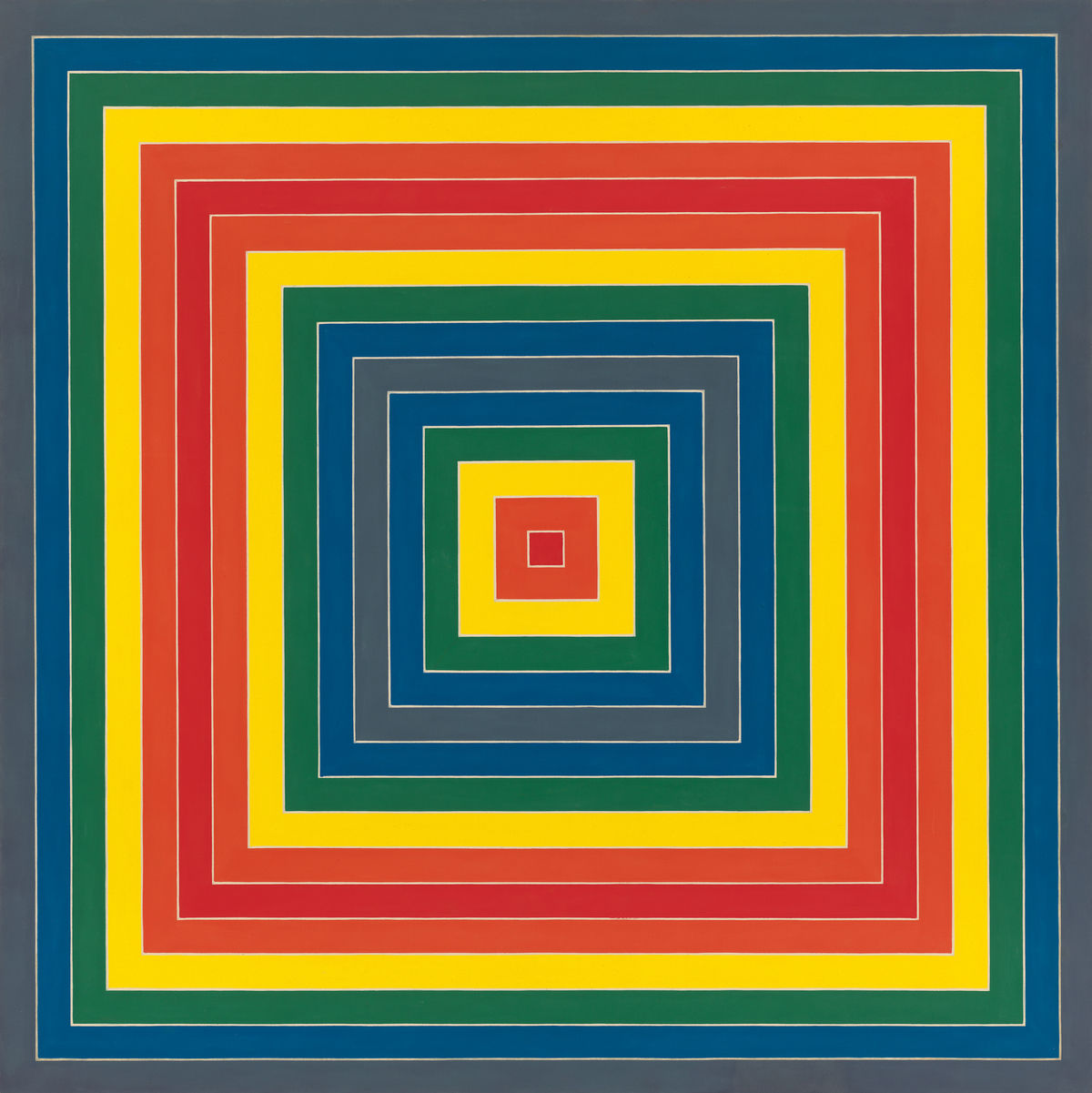
I’m not sure what “social,” “political,” or “environmental” means in relation to color. What about color as pure delight? Think about the advertising art and the riotous counterculture and counterculture-inspired fashions of the 1960s—psychedelic prints, hand-blocked Indian textiles, and all the rest of it. But however we interpret the works in “Spilling Over” and whatever meanings we choose to attach (or not to attach) to them, it’s exhilarating to enter the Whitney’s sky-lit top-floor galleries and find ourselves surrounded by intense hues of radically different characters, applied in many different ways. The show is full of terrific, radiant paintings, all from the Whitney’s own holdings, plus one promised gift. Some works—such as Kenneth Noland’s dazzling New Day (1967), with its inventive orchestration of colored horizontal stripes; Frank Stella’s jaunty Gran Cairo (1962), with its nested, contrasting squares; or Frank Bowling’s misty Dan Johnson’s Surprise (1969)—were acquired by the Whitney soon after they were made. The Bowling, for example, was purchased when it was included in the 1969 Whitney Annual, the precursor to today’s Biennial. But many of the works on view, such as Helen Frankenthaler’s glowing Orange Mood (1966), which came to the museum in 1977, have not been shown in decades, so the installation can be read as, among other things, a thought-provoking report on the vagaries of taste. To enlarge the discussion, Emma Amos’s Baby (1966) and Kay WalkingStick’s April Contemplating May (1972) are new additions, both now exhibited at the Whitney for the first time.
The show’s subtitle, “Painting in Color in the 1960s,” can raise expectations of an emphasis on what Clement Greenberg called “post-painterly abstraction” in 1964, when he organized an exhibition with that title for the Los Angeles County Museum of Art; I’ve even heard “Spilling Over” described as “the Color Field show.” (“Post-painterly,” of course, is a nod at the Swiss art historian Heinrich Wölfflin’s classification of “painterly” painting—the broad brushwork and softly modeled forms of the Venetian Renaissance, for example, as opposed to Florentine clarity and crisp drawing. Greenberg updated “painterly” to refer to the loose, layered paint application of gestural Abstract Expressionism, which he referred to derisively as “the Tenth Street touch.”) “Post-Painterly Abstraction” surveyed a new generation of painters who challenged Ab Ex’s tonal modulations and heightened emotionalism—synonymous with serious painting for more than a decade—with thin, radiant expanses of clear intense hues. Later termed Color Field painters, the “post-painterly” artists made color the main carrier of meaning in their pictures and substituted a kind of cool detachment for overt drama.
As we would expect, there are important works by some of the artists featured in Greenberg’s “Post-Painterly Abstraction” at the Whitney, most of them made within a few years of that seminal exhibition. Frankenthaler, Noland, Stella, Morris Louis, and Ellsworth Kelly are all prominent in “Spilling Over,” almost all represented by works purchased within a year of the picture’s making. All the paintings, from Louis’s cascades of fluid, intense chroma to Kelly’s confrontational lozenges of saturated blue and green against saturated red, are textbook examples of how disembodied, brilliant hues, detached from imagery and allowed to address us entirely for their own qualities, can ravish the eye and trigger associations. The chromatic dazzle of these paintings informs the entire exhibition. It’s the defining quality of Miriam Schapiro’s eye-testing Jigsaw (1969), which shifts between an illusion of three-dimensional blocks and flat geometric pattern, as well as of Marcia Hafif’s 72., March 1965 (1965), a stripped-down confrontation of two swoops of color wheel opposites across off-white, and of Alvin Loving’s Septehedron 34 (1970), a six-sided (despite its name), superheated red canvas that, like the Schapiro, keeps flipping between the illusion of a fictive geometric structure and the fact of flat, bright paint on canvas. There’s even a zingy red on red on red-orange Josef Albers, Homage to the Square: “Wait” (1967), included as if to give a respectable history to paintings that are about relationships of color, rather than about narrative or representation.
There’s even a zingy red on red on red-orange Josef Albers, Homage to the Square: “Wait” (1967), included as if to give a respectable history to paintings that are about relationships of color, rather than about narrative or representation.
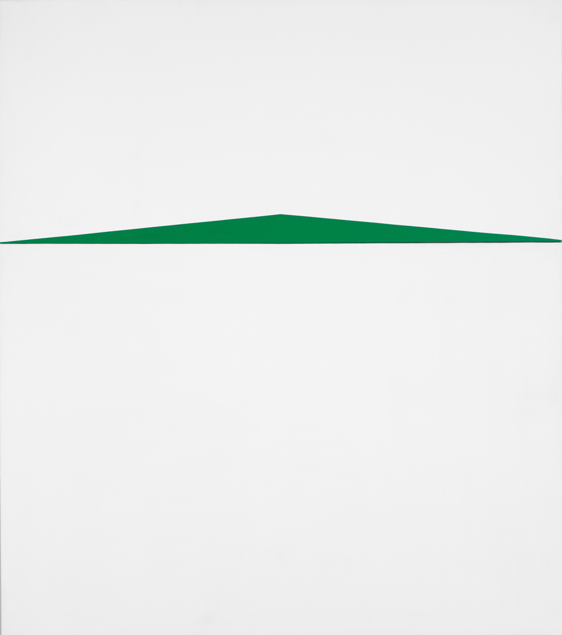
As this list suggests, abstraction, intensity, and, to a great degree, geometry, would seem to dominate the selection. The notion is reinforced by the first painting we encounter as we step off the elevator: the vast, horizontal Noland, with its shimmering stack of weightless, unnameable colors arrayed in stripes of subtly varied width and hue. Struggling for attention on the same wall is a much smaller Carmen Herrera, Blanco y Verde (1959), a thin, very wide green triangle stretched to its limits across the vertical white rectangle of the canvas. The work was purchased in 2014, about the time the elderly, determined Cuban-American’s work was “discovered.” The Noland blows the Herrera off the wall. It’s not simply a question of relative size, but of visual opulence and vitality. The Whitney’s installation is as unfair to Blanco y Verde as the subtitle of the Met’s “Epic Abstraction: Pollock to Herrera” is to the artist herself, a snappy phrase that suggests an equivalence between the legendary maker of swirling, tangled expanses of poured paint and the amazingly long-lived (she’s about to turn 104) exponent of a rather familiar strain of cerebral, geometric Latin American painting. The idea is difficult, if not impossible, to sustain, quite apart from the question of whether the modestly sized Herrera in the Met’s exhibition—three black triangles on a white ground—qualifies as “epic.” Whether or not Blanco y Verde satisfies the apparent criteria for inclusion in “Spilling Over” is another vexed question, since I’m not convinced that color is of particular interest to Herrera; the placement and proportion of her geometric shapes in relation to the canvas seem to be of far more concern than the choice of hue used to make those shapes. But the more important issue, heretical as this may sound, is that both the Met’s subtitle and the Whitney’s decision to install Blanco y Verde where it is seem predicated not only on politics rather than aesthetics, but also on overestimating Herrera’s achievement. She’s a fine painter, within her self-imposed limits, but it’s downright cruel to expect her to sustain the featured role imposed on her by both exhibitions.
On the plus side, “Spilling Over” includes some interesting surprises. If the show’s subtitle suggests a concentration on Color Field painting, and if our initial confrontation with Noland and Herrera prepares us for an exhibition dedicated to brilliantly colored geometric abstractions, we are soon made to abandon both ideas. David Breslin’s definition of color embraces subtlety as well as full-throttle chroma, as we discover when we come across Sam Gilliam’s Bow Form Construction (1968), an oversized swag of pastel-hued, stained canvas. The enormous draped arc of peach, pink, and blue swipes makes us rethink the centuries-old tradition of the stretched canvas, at the same time that the curving bundle of the painting, with its folds and hollows, reads as a kind of vernacular, wholly contemporary distillation of the Baroque. Bowling’s Dan Johnson’s Surprise is similarly restrained in color; a row of pale, blurred images of the South American continent, delicate and soft-edged, at once recognizable and abstract, float across the canvas against a muted, diaphanous expanse of stains and runs, anchored by crisp bars of denser color at the edges.
The imagery of Dan Johnson’s Surprise is almost covert, and (it can be argued) maps are by their very nature abstractions, so it’s possible to consider Bowling’s painting in relation to Color Field, albeit with subdued hues. Certainly his sprayed-on paint, washy expanses and visually weightless surface bear witness to his sympathy for the disembodied expanses of color announced by Frankenthaler’s early stain paintings and proclaimed in this exhibition by her Orange Mood, with its pool of superheated orange, flanked by zones of gold, ochre, deep blue, and weighty green. (Bowling’s more recent work largely bears this out.) Gilliam’s unstretched canvas belongs more evidently to this general category, even though the swells and recesses of the drapery make us preternaturally aware of the physicality of his materials. Yet almost from the moment we enter the galleries where “Spilling Over” is handsomely installed, we are faced with paintings that are no less about color and no less autonomous than the Gilliam and the Frankenthaler, but are based on an entirely different set of assumptions.
Visitors still thinking of “Spilling Over” as a Color Field show will have to readjust their preconceptions radically, since some of Breslin’s selections astutely remind us that a fascination with the capabilities of color transcends specific aesthetic predilections. The exhibition includes potent works by painters just as dedicated to exploring the expressive possibilities of chroma as any of the Color Field painters or the geometric abstractionists in the show, but also committed to the possibilities of recognizable imagery. Alex Katz’s small, vivid Edwin, Blue Series (1965) is as much about a luminous ultramarine expanse as it is about the highly simplified, dispassionate image of the poet and dance critic Edwin Denby. A plane of that blue, in fact, overlaps the writer’s shoulder, forcing us to acknowledge the artifice and flatness of the economically rendered, half-length figure by canceling out the suggestion that painting refers to a logical setting. Emma Amos’s Baby (1966) makes a fragmented female figure—head and shoulders below, a suggestion of legs depending from the top of the canvas—equivalent to the bold, pillowy shapes of full-bore color with which she builds her paintings, while the shrillness of that color makes us concentrate on shapes and thrusting lines, almost at the expense of references to the body; the play of small-scale blue elements across the surface, now seemingly independent, now freely referential, distracts us further. Sometimes we read the colliding masses as an abstracted setting for the figure (or is it figures?), while at other times the figure fragments lock into the larger abstract structure. The fiercely brushed circles that stand for (or conceal) the woman’s eyes reinforce this double reading.
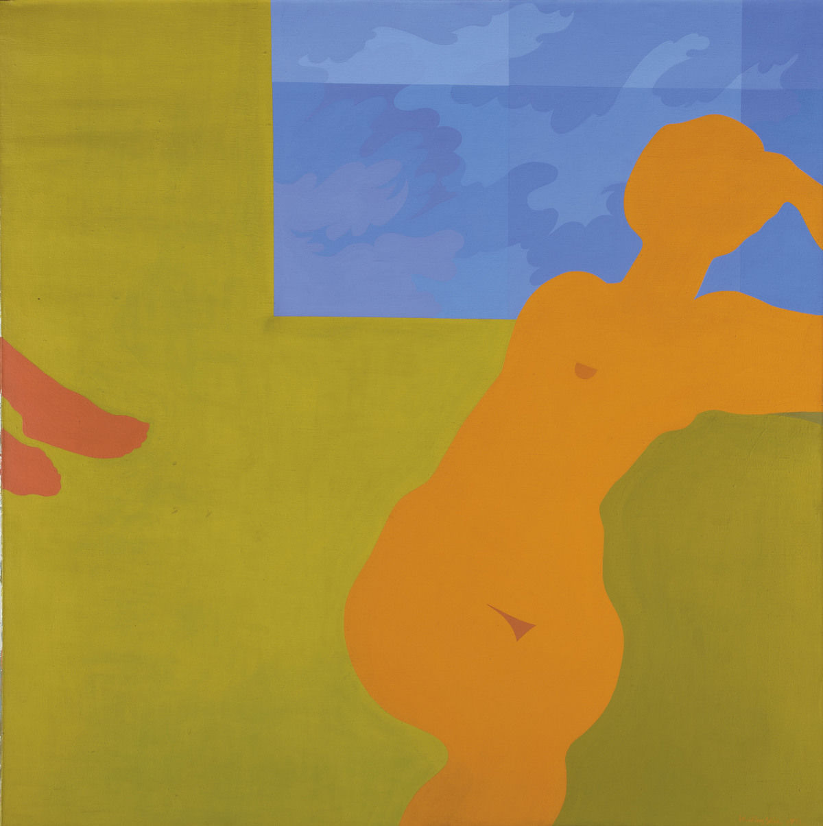
In a similar fusion of the immediacy of recognizable figures and the excitement of mouth-puckering color at maximum strength, Kay WalkingStick’s April Contemplating May pares to essential silhouettes two female forms, one a seated nude, the other visible only from the ankles down, thrust in from the side of the canvas. The flat shapes of the women are locked into a plane of vibrant yellow-green interrupted by a rectangle of mottled blue. We read these minimal indications as setting, window, and body, thanks to the specificity and economy of WalkingStick’s shapes, with help from such clues as a crucially placed nipple. The tension between the curvaceous flat form of the seated nude and the uninterrupted flatness of the ground animates the picture. Henri Matisse haunts April Contemplating May, as he haunts, in less overt ways, many other works in the show.
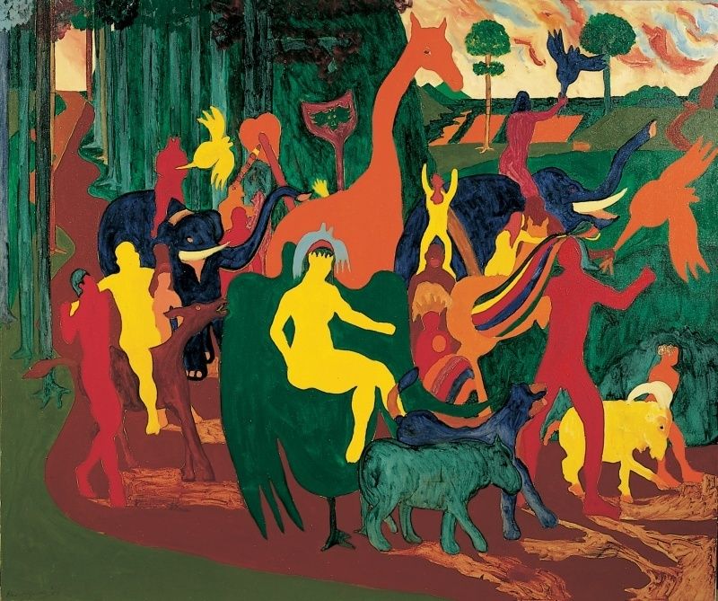
Any exhibition titled with an acknowledged quotation from an artist will, of course, include a work by that artist, but that’s clearly not the only reason for the presence of Bob Thompson’s Triumph of Bacchus (1964), a dense, rowdy patchwork of busy figures and animals, with a hint of Renaissance landscape in the background. The allusive painting is part of a series commenting on old master paintings, translated into Thompson’s hip, streetwise idiom of simplified, ambiguous shapes and souped-up color—the young painter’s response to an extended sojourn in Europe in the last years of his too-short life. These insouciant versions of celebrated themes, sometimes with clear references to well-known prototypes, have been compared to the improvisations of jazz musicians who dissect, invert, embellish, and strip down familiar tunes to produce new inventions. It’s an apt analogy for the work of the jazz-loving, knowledgeable painter. We feel we recognize elements of Triumph of Bacchus but fail to identify the precise source, taking refuge, instead, in the play of sinuous shapes and astringent, bracing color.
If we spend enough time with “Spilling Over,” we start seeing unexpected, almost certainly unwilled commonalities among the assembled works. We begin to sense conceptual and structural similarities, for example, in the symmetrical, curvilinear composition of Hafif’s very reduced, emblematic 72., March 1965 and in WalkingStick’s slouching nude, hips swelling against an uninflected plane. It’s enough to make you believe in a zeitgeist or at least in shared desiderata, in response to the particular conditions of a given moment. Maybe that’s what Breslin means by “social, political, and environmental.”
Coda: Are there artists conspicuously absent from “Spilling Over”? Yes, quite a few, even if we allow for the space limitations of the Whitney’s top-floor galleries. The same is true of “Epic Abstraction,” even if we acknowledge that no exhibition can simultaneously honor heroes and enlarge the canon. Happily, some of the Whitney’s missing artists, such as Alma Thomas, Anne Truitt, and Mark Rothko, are on view at the Met. (The Whitney’s Morris Louis is better than the Met’s, but that’s another matter.) Combine the two shows and there would still be notable lacunae, but our sense of the complexity and richness of what was happening in the American art world in the second half of the twentieth century would be much enhanced. See both.
1 “Spilling Over: Painting in Color in the 1960s” opened at the Whitney Museum of American Art, New York, on March 29 and remains on view through August 2019.